
In the realm of education, visual communication plays a crucial role in conveying complex ideas. One striking example is the National Model of Professional Learning, which is depicted through a compelling circular graphic composed of concentric circles.
The Visual Structure
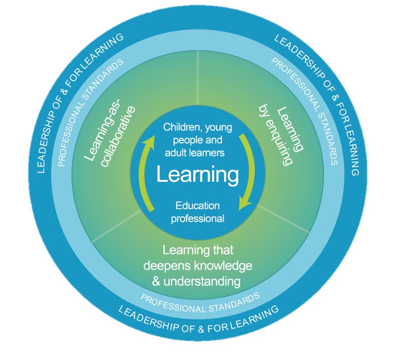
At first glance, you will notice that the model is designed with four concentric circles (or three rings surrounding a central circle). The two outer rings are of equal width, while the inner ring’s breadth matches the radius of the central circle. Each component features shades of blue and green, with three areas using flat colours and one ring showcasing a gradient that lightens toward the centre. This gradated ring is divided into three equal segments, clearly marked by faint white lines radiating from an unseen centre.
The central circle, coloured blue, is adorned with two green arrows that curve clockwise along its outer edge. The annotations within the circles, rendered in a simple white font, differ in style: uppercase in the outer bands and sentence case in the inner bands, with varying font sizes that emphasize the hierarchy of information.
The Importance of Visual Elements
The interplay of shape, color, tone, and scale is pivotal to the model’s effectiveness. For instance, the contrasting shades of blue and green enhance legibility, as the white font stands out against the colored backgrounds. This contrast is not merely aesthetic; it serves a functional purpose—ensuring that the annotations can be easily read and understood.
Moreover, despite the physical separation between the outer rings and the central circle, the shared blue hue connects them visually, highlighting the relationship between the broader concepts and the core ideas within the model. Such intentional design choices prompt us to consider deeper questions: Who constructed this model, and for what purpose?
The Role of Visual Analysis
Describing these visual elements is more than a superficial task; it’s an essential part of analysis. By unpacking the visual components, we can better grasp the “how” behind the National Model of Professional Learning. This visual analysis is particularly important because it employs a visual language to communicate key concepts and competencies tied to regulatory standards and educational reform.
At the heart of educational policy, this model represents a framework for professional learning, making the need for clear visual communication all the more significant.
The design of the National Model of Professional Learning is not just a matter of aesthetics; it is a powerful tool for communication in education. Understanding how visuals convey meaning can help educators and policymakers navigate the complexities of educational reform. By engaging in visual analysis, we can uncover layers of meaning that influence professional learning and ultimately shape our educational practices.
Acknowledgment
I used AI in developing this post. It was useful for clarifying my thoughts and finding a ‘blogging-voice’ that previously escaped me. I’ve saved the transcript.